← Back to projectsHomepage
Homepage
Redesign
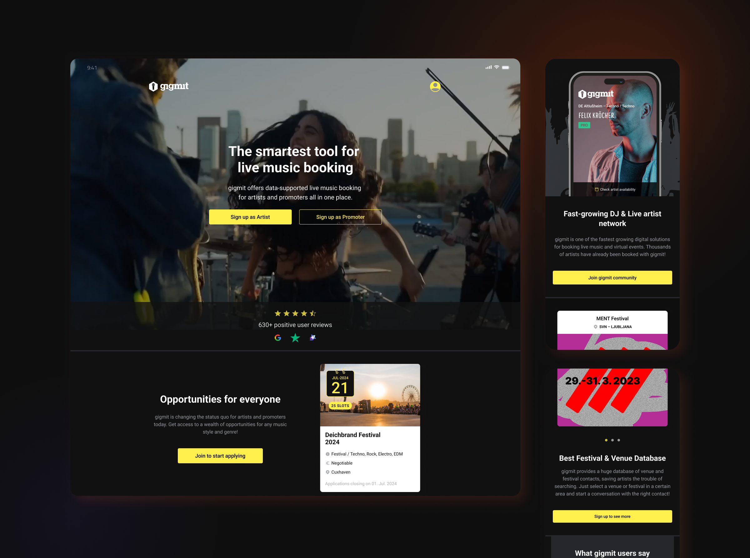
gigmit is a digital platform connecting artists with promoters and venues, simplifying booking for live music events. As Product Designer & UX Researcher, I led a full redesign of the registration and onboarding flow to improve conversion and reduce drop-off.
+79%
Visitors who started registration
+108%
Mobile conversion rate
-10.6 pp
Drop off
Challenges
Increase the number of users starting the registration process. Support improvements in the overall registration flow. Prioritise mobile usability and accessibility. Strengthen gigmit’s branding and community-driven message.
Process
Pre-Launch Analysis: Reviewed traffic sources and user behaviour using heatmaps, identified friction points and drop-off areas, and analysed niche competitors. Design & Content Strategy: Developed a value proposition centred on community, simplified homepage layout and visual hierarchy, added clear CTAs, applied design writing to refine copy, and ensured mobile-first accessibility. Post-Launch Validation: Measured behaviour with heatmaps and analytics (Amplitude) to verify design impact and iterated where necessary.
What I changed
Key redesign moments from gigmit onboarding
Four focus areas grounded in research, flow, conversion, and validation — each illustrated with a key gigmit screen.
Results (Mobile Users)
Mobile Users
started registrationBefore
13.4%
→
After
24%
+79%
Mobile Users
conversionBefore
3.86%
→
After
8.02%
+108%
Mobile Users
drop-offBefore
86.62%
→
After
76.03%
-10.6 pp
What I learned
Redesigning the homepage taught me that clarity and motivation go hand in hand. When users instantly understand what’s offered and why it matters, they’re far more likely to take the next step. Improving sign-ups wasn’t about flashy visuals — it was about empathy, focus, and reducing friction at every click.